Image Icon Effect is another star module making it easier for your readers to ‘Focus’ on the texts you put on your relevant images.
Pick your favorite from the 6 most interesting hover effects making your post attractive to all visitors.
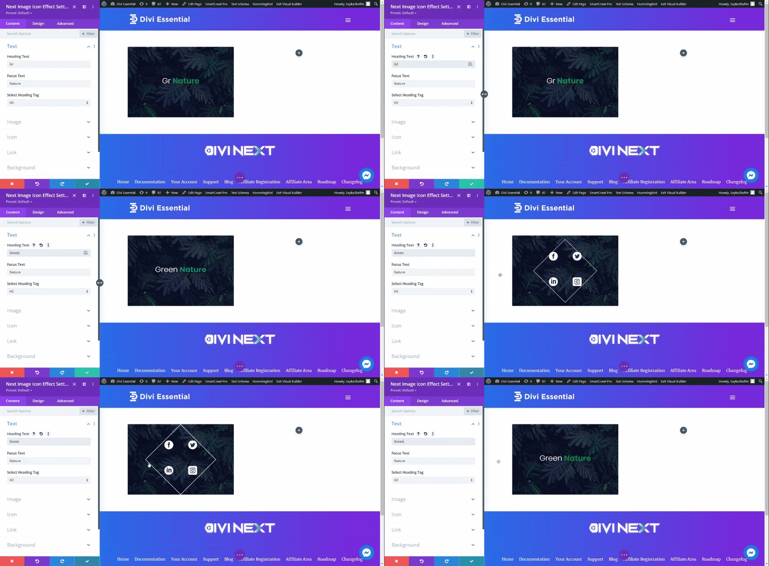
Content → Text
- Heading Text - type the Heading Text in the content field.
- Focus Text - type the Focus Text in the content field.
- Select Heading Tag - choose a suitable heading tag
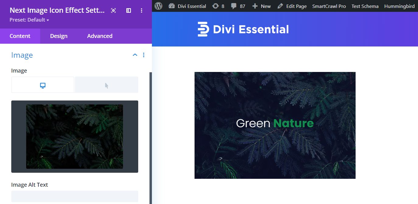
Content → Image
Image - select a picture to show in default and select an image when hovered.
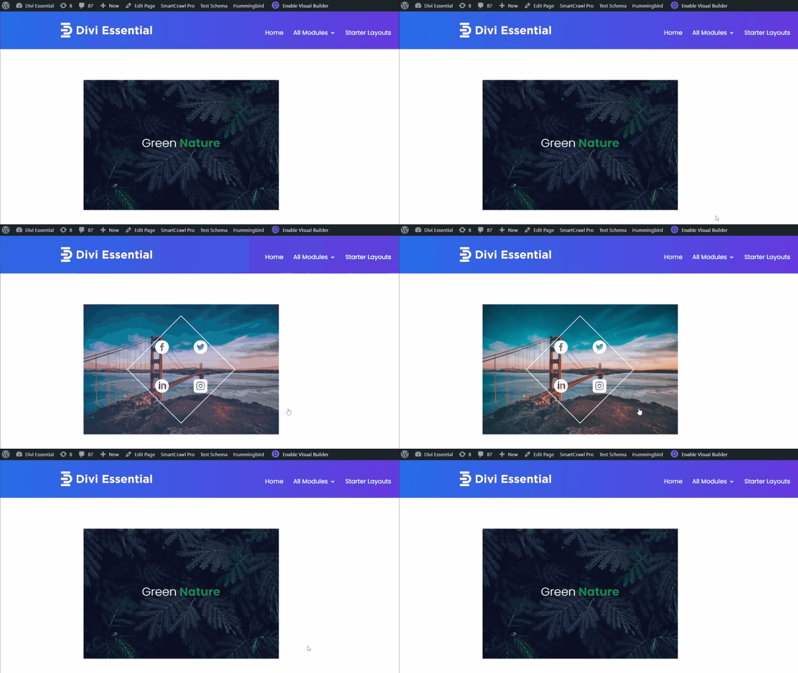
After placing both the images this is how it looks on the front end.
Content → Icon
Include Icons one through four within the Icon feature.
Content → Icon
- Use Icon - enable the switch to use an Icon
- Icon Link Target - place a link for the Icon
- Icon - select a suitable Icon for your design from the many premade icons in the collection.
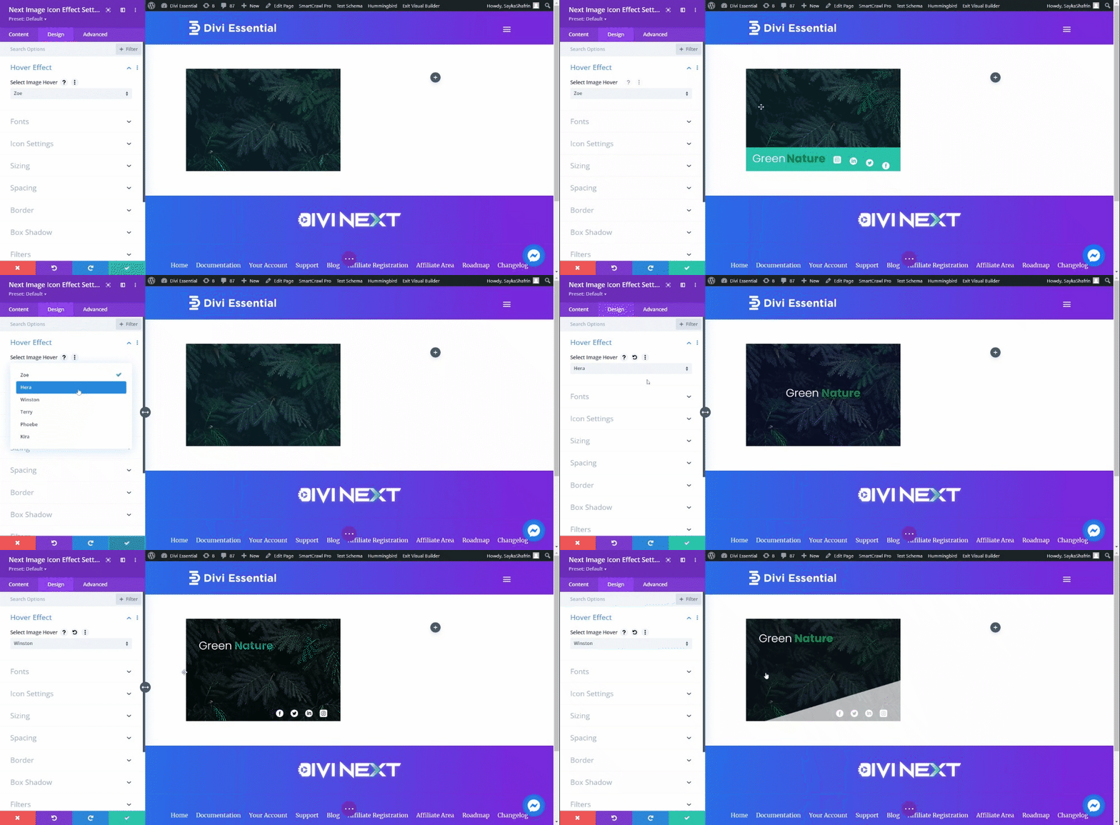
Design → Hover Effect
Select Image Hover - from the six trendy hover effects, select the one that best suits your design.
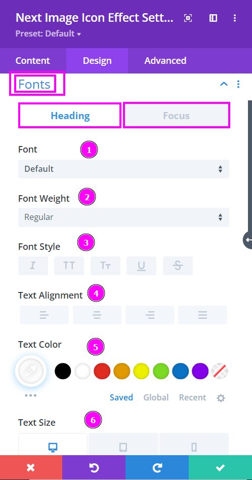
Design → Fonts
Here we discuss what options you’re getting for text stylization of the heading and focus texts within the Image Icon Effect module.
- Font – Select a font from the collection or use custom font.
- Font Weight – this is where you define how you want your font to show either regular, italic, bold extra, or even extra light.
- Font Style – Pick a style of font for the design.
- Text Alignment – align the text to the left, right, or center.
- Text Color – manually select a color for the background of the text using the pointer or you can simply state the hex code and get the exact color you require.
- Text Size – easily resize the text using the slider for desktop, tablet, and phone.
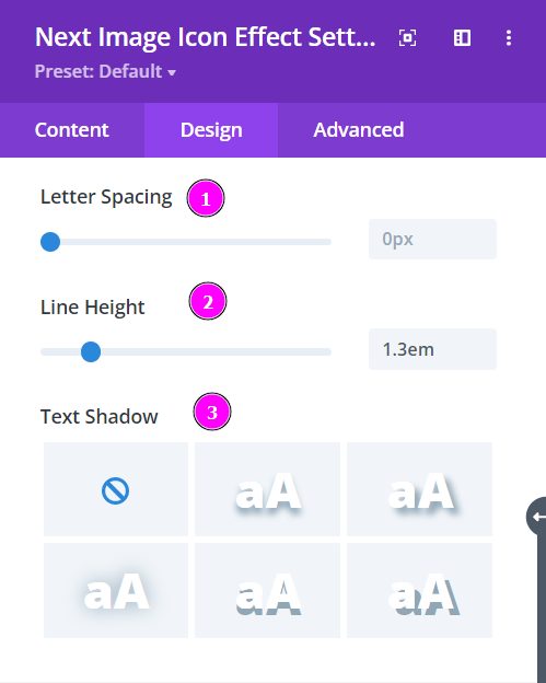
Design → Fonts (continued)
- Letter Spacing – space out the letters using the slider for an easier read for the website visitors.
- Line Height – adjust the space between the lines using the slider.
- Text Shadow – select a prebuilt shadow for your text
Design → Icon Settings
Choose a color for each of the four icons. You can use the color picker to select a color or place the hex code to achieve the exact shade required for the design.
Design → Icon Settings (continued)
- Icon Size - Use the slider to adjust the icon size for desktops, tablets, and phones.
- Icon Spacing - adjust the spacing between the icons
- Icon Line Height – change the space between the lines using the slider.
- Use Icon Background - choose a background color for the icons.
- Text Shadow - include shadow to the icons.
- Rounded Corners - adjust the four corners of the icons to get rounded corners on each or all four corners.
Design → Icon Settings (continued)
- Border Styles – include borders on any side of the text or all four sides.
- Border Width – adjust the width of the border using the slider.
- Border Color – pick a color for the border that you’ve added.
- Border Style – select a style of the border from the premade border styles.